Branding · Visual identity
Kloth
You have to step outside what’s familiar before you find what actually looks like you.
A full identity for Kloth, an AI-Twin-first, try-before-you-buy fashion platform. A wordmark with a person hidden in the K, a loud four-colour palette made to survive the scroll, and a system that runs from strategy to hang tags, mailers and woven labels.
- Client
- Kloth
- Year
- 2026
- Role
- Branding
Strategy
India’s AI-Twin-first, try-before-you-buy fashion platform, for people who want proof before they pay.

The mark
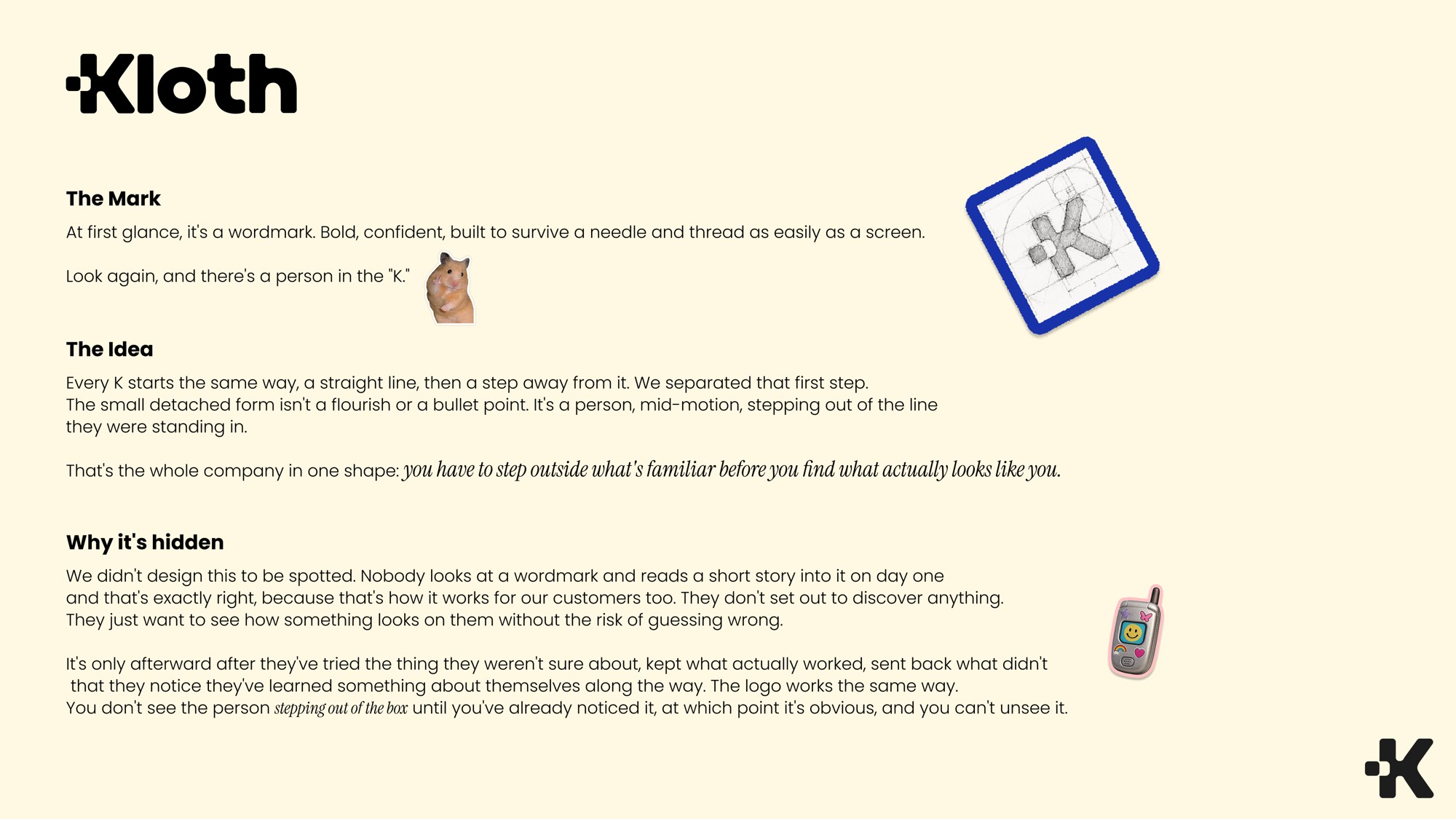
Every K starts with a straight line and a step away from it. That first step is split off: a person stepping out of the line.
Colour & type
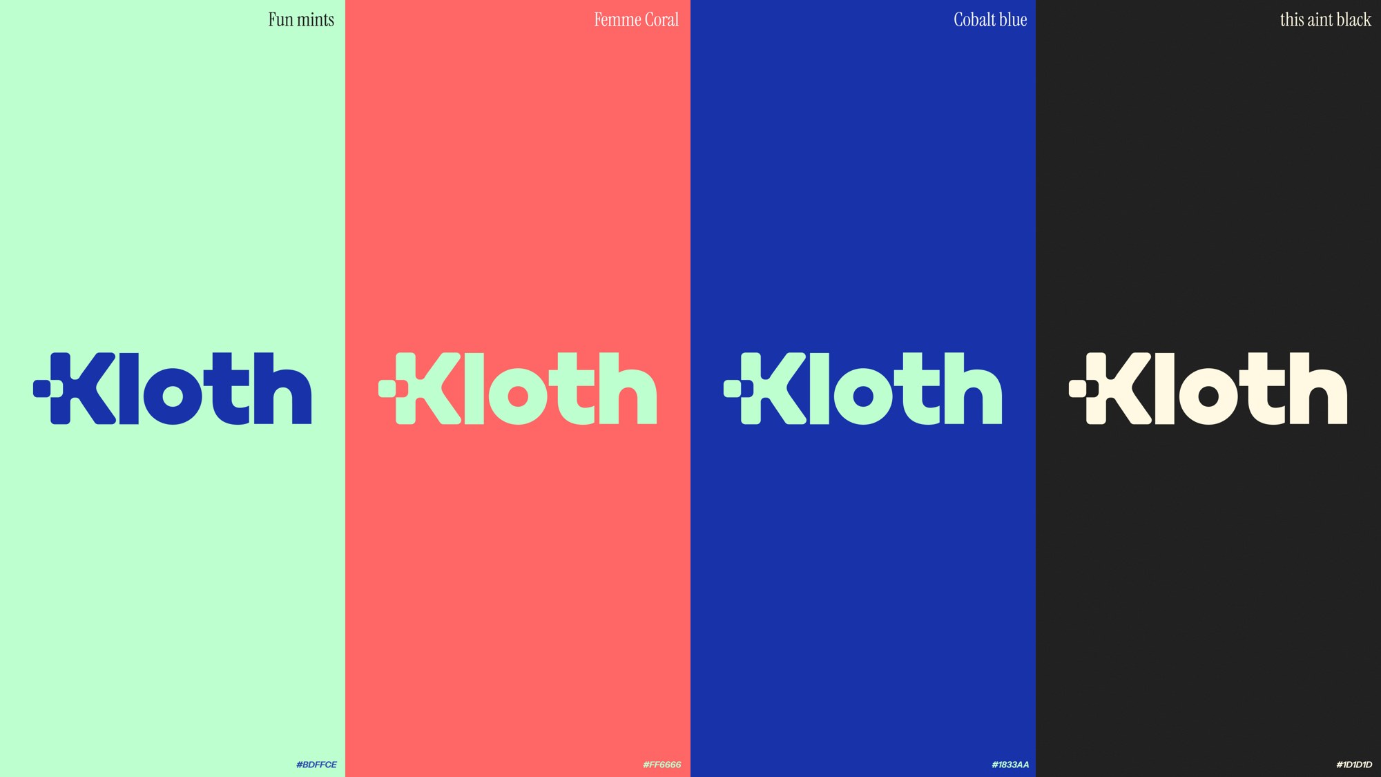
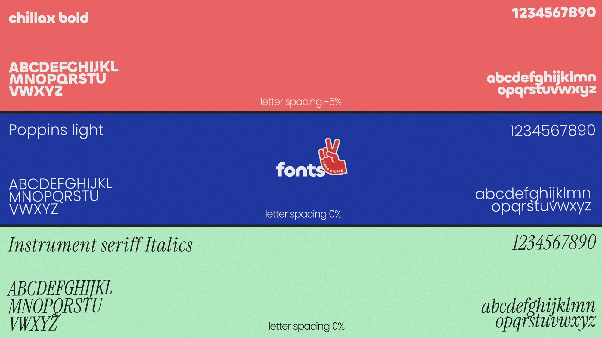
Fun mints, Femme Coral, Cobalt blue and “this ain’t black”, set in Chillax Bold, Poppins Light and Instrument Serif Italics.
Logo in use
Clear space measured with the mark’s own dot, and the wordmark on every brand colour.
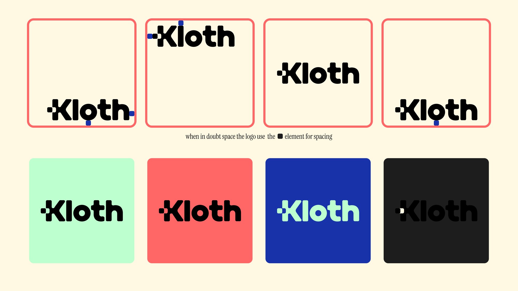
Image treatment
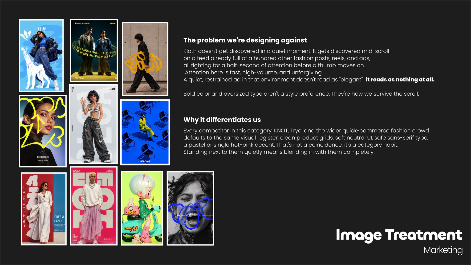
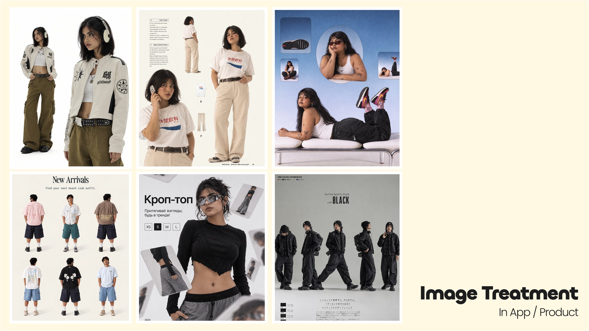
Loud for marketing, built to survive the scroll. Editorial and calm inside the app.
Two sides
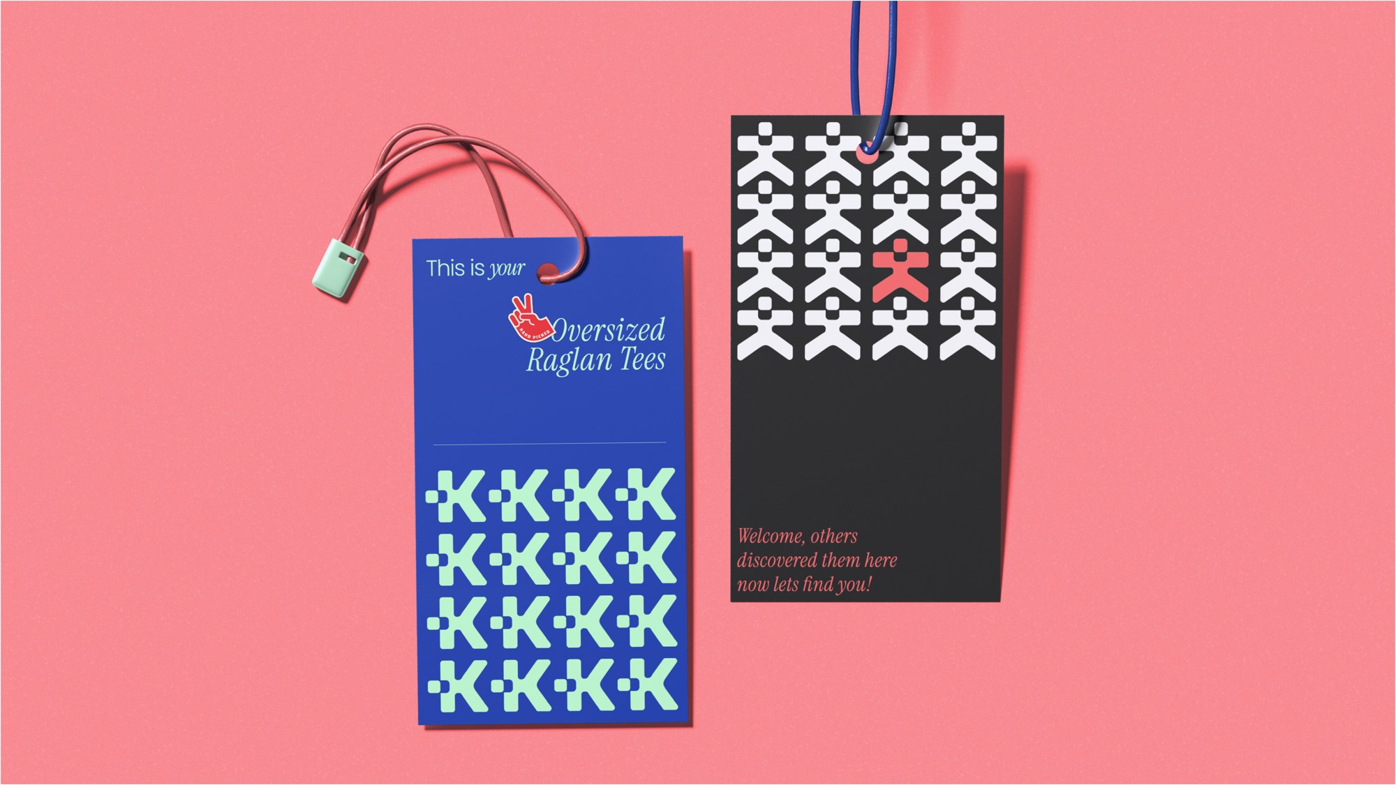
Anything with a front and a back tells the same story: before you find your style, and after.
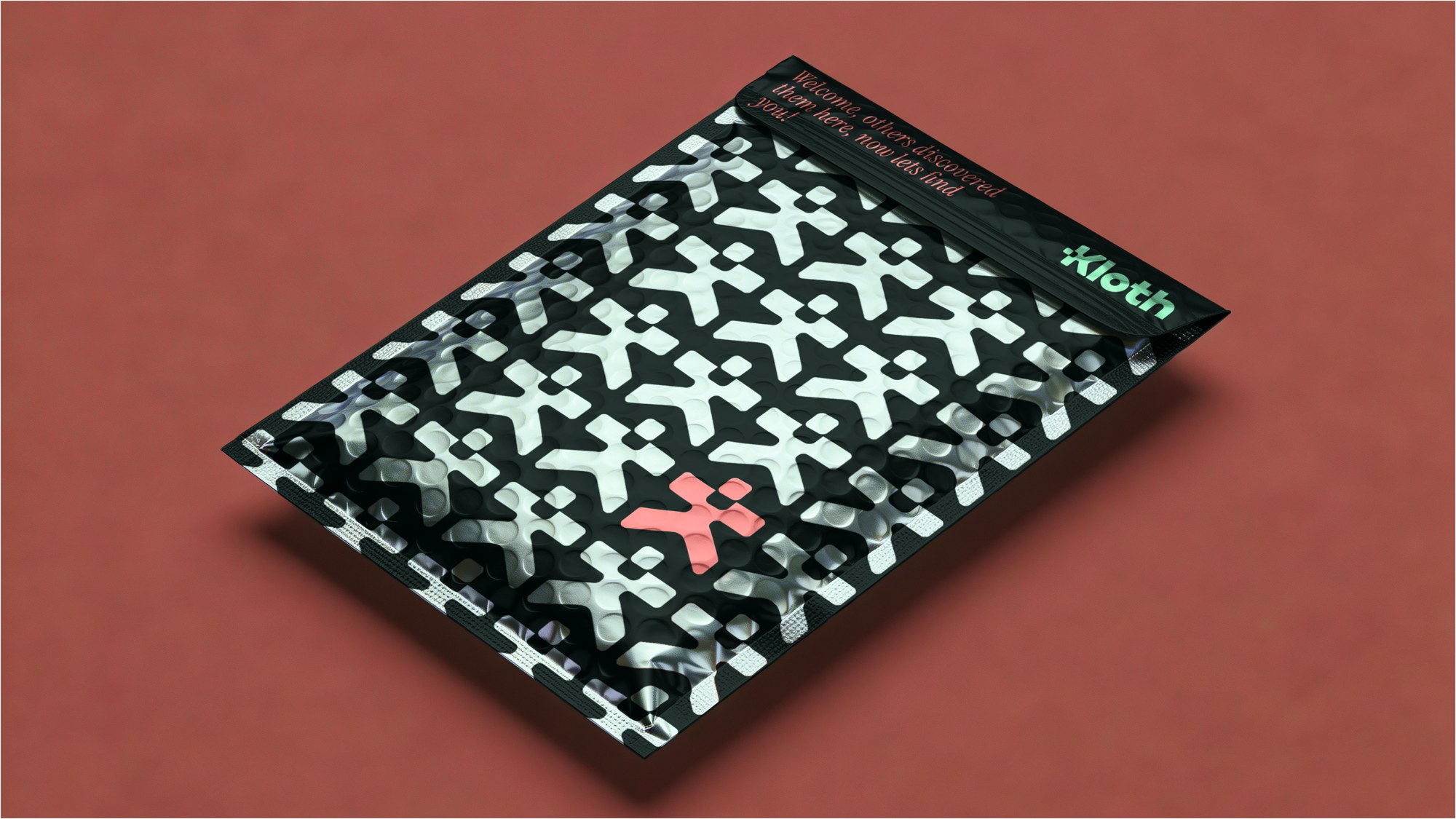
A lot of people struggle to know what their style is: what their look should be, what to wear. Kloth helps them find it. At first the logo just reads as a word. Only later do you notice the K is a person, someone who was unfound before and has stepped out into who they can be. Every two-sided piece of print carries that idea: one side dark and muted, the other bright and bold.
Applications
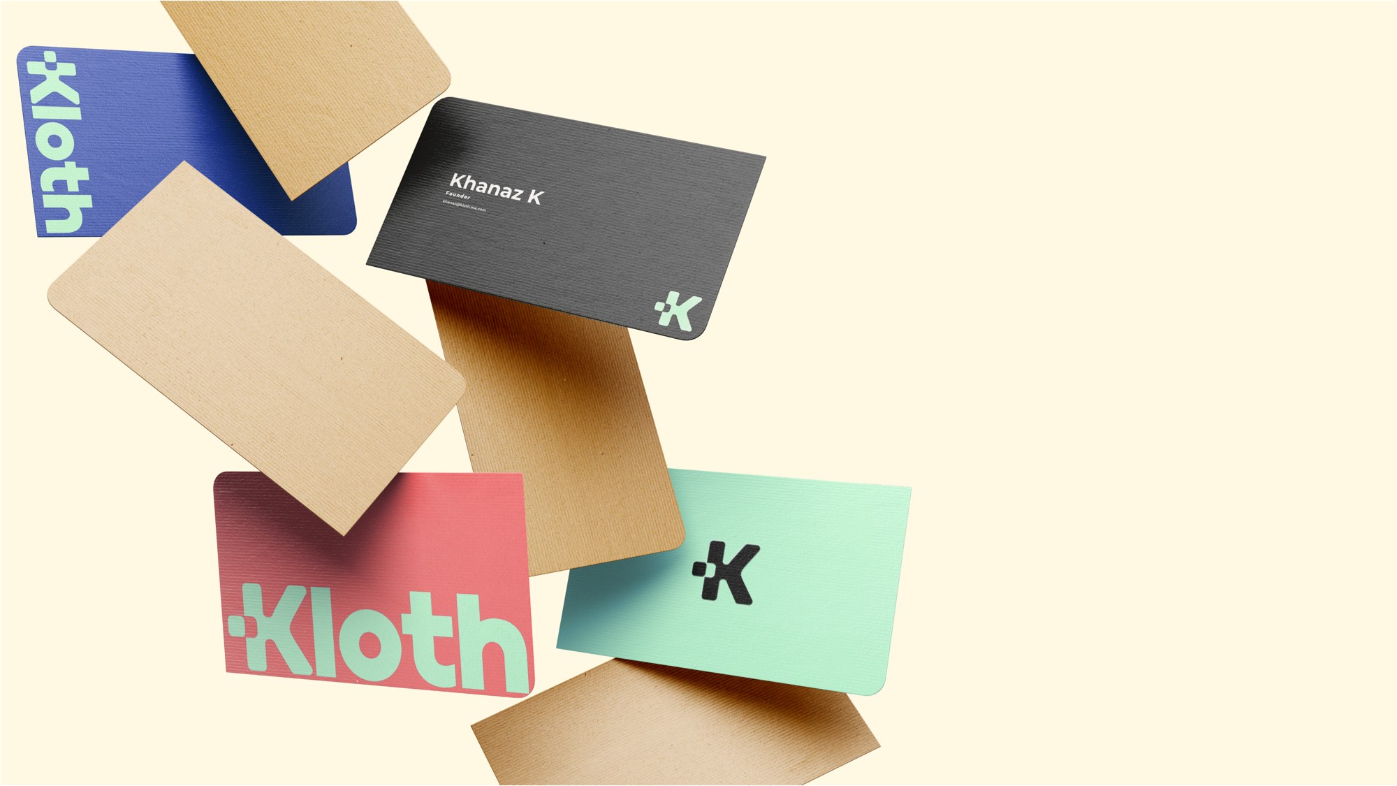
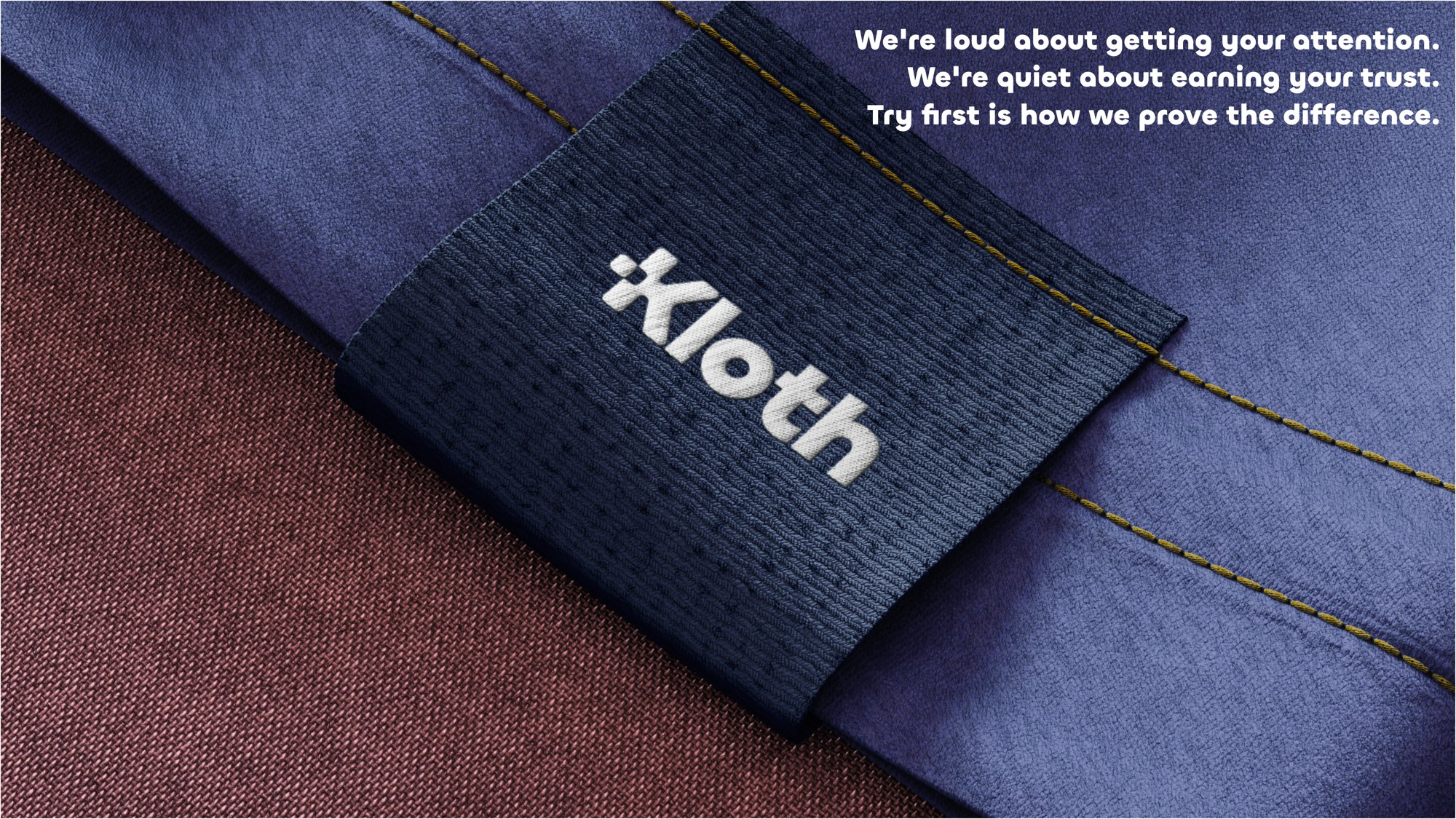
Cards and woven labels, all carrying the stepping-out figure.